During a lecture at EMC’s 2nd Annual
University Day on Monday, I held a dialogue with faculty and students gathered at
our Santa Clara campus. I described how EMC uses an analytics framework (Pivotal/Greenplum) to accelerate the innovation that emerges from our global academic research partners. In
particular, I highlighted the following capabilities of our innovation
analytics platform:
- A visualization of the “types” of research
currently active in our portfolio (e.g. solid state storage, analytics, etc). - A visualization of the “types” of research by
region (e.g. where in the world do we research compression technology?) - Who are EMC’s key researchers in any given
region? - Which researchers are the best at transferring
knowledge out of their region? - For any given EMC researcher, what type(s) of
research do they conduct? - What is the complete list of EMC employees, per
region, that are involved in any form of university research? - How can global EMC employees advance their own
ideas by locating relevant university research? - How do we augment university research with other
external employee connections (e.g. programmatically leverage their Twitter
connections)
In this post I’d like to focus on the first bullet. EMC has
dozens of university research partnerships worldwide. How do we dynamically
visualize the current areas of exploration that are occurring across the globe
at any given point in time? How can we determine which strategic research areas
have strong coverage and which areas may have no coverage at all?
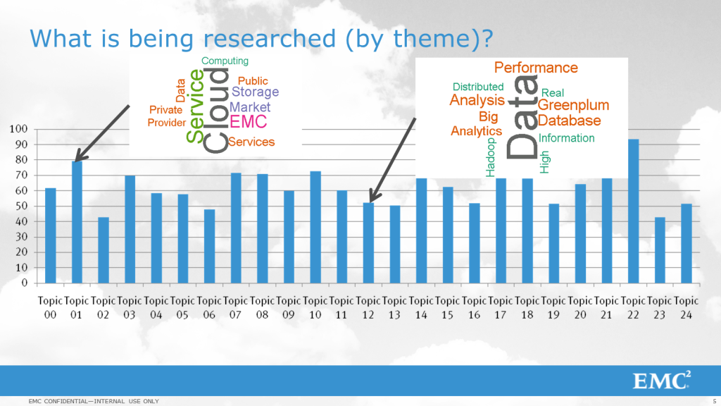
These questions are currently answered through our use of
the functionality provided within the Stanford Topic Modeling Toolbox. The
diagram below helps explain our use of this tool:

The Topic Modeling Toolbox analyzes the analytic repository
containing university research activity. Data
Scientists within EMC (working as part of our EMC Labs China team) categorize
these research activities by providing the toolbox with a number (e.g. N = 25).
The toolbox runs algorithms that classify each research activity into one of
a number of different buckets using the toolbox algorithm.
Once the toolkit has taken a pass at every document, the bar
graph above shows the level of activity for each “class” of research
initiative. I asked our Data Science team to provide a simple word cloud
algorithm across each category, and it is fairly easy to see at a high level
that Topic 01 has a cloud focus, while Topic 12 has a Big Data focus.
Furthermore, if the data above was analyzed in a given time
frame (e.g. the first half of 2013), Topic 22 would be viewed as “most active”,
while Topics 02 and 23 would qualify as “least active”. This may or may not be cause for concern
depending on the nature of the work. In
fact, given topics can be broken down into the “nature of the engagement”,
which is highlighted below:

While this type of data gives EMC a great idea about “what”
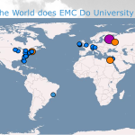
we are researching, it doesn’t provide any data at all about “where”.
I will cover EMC’s approach to solving this problem in a
future post.
Steve
EMC Fellow