I’m writing a series of posts about the use of analytics to improve the innovation capacity of my company (EMC). My team is running a yearly Innovation Conference and Showcase that has resulted in 1,590 ideas arriving from around the world. On Nov 30th in Santa Clara, the Chief Technology Officer of EMC (Jeff Nick) will announce the ideas that will receive incubation funding in 2012.
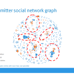
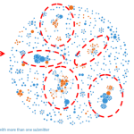
The database that contains all of the idea submissions represents valuable intellectual property, but the social graphs that lie hidden within the database represent something of great importance as well.
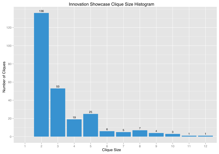
In social network analysis (SNA), a clique is a group where each member has a direct relationship with the other members. For the Innovation Showcase database, this means that the clique members all submitted at least one idea together. Using R, it’s possible to identify the cliques in the contest’s social network. To start, let’s analyze the clique sizes by plotting them in a histogram.

John Cardente, a newly appointed EMC Distinguished Engineer, is responsible for the Innovation Showcase analytics that I’ve been sharing in recent posts. He’s been doing this work in his spare time to pursue an interest in data science. I asked him to investigate the contest’s social network to identify “cliques” of innovators. Here’s what he found.
“The clique histogram is similar to the team size histogram shared in a previous post. This makes sense as cliques are essentially teams. However, a comparison of the two histograms reveals that there are fewer cliques than teams. This suggests that many cliques submitted multiple ideas. This raises two questions. How many ideas did each clique submit and did larger or smaller cliques generate more ideas? The following chart attempts to answer both questions.”

“Each dot is one of the 260 cliques in the contest’s social network. The X position is the clique’s size while the Y position is the number of contest entries submitted by only its members, either all together or in sub-cliques. A small random value has been added to each dot’s X and Y position to avoid over plotting (this is known as a jitter plot).
The orange line is a LOESS regression model fitted to the data. The gray band around the orange line is the LOESS model’s 95% confidence interval.
This chart shows that cliques of all sizes submitted a large number of contest entries. However, the orange line’s upward slope suggests that larger cliques tended to submit more entries and therefore exhibited a higher level of innovation.”
John’s conclusion that larger cliques produce higher submission rates leads me to ask further questions:
- Do larger cliques producing “better” ideas (e.g. were they selected as finalists)?
- Are large cliques all in one geography?
- Do large cliques tend to submit ideas that have a common theme?
- Do large cliques contain employees from different functional teams, or are they in a common organization?
How do we prioritize where to go next with the analysis? My overall goal is to improve and increase EMC’s organic innovation capacity. I’ve decided to base my next steps on something I learned from MIT Professor Sandy Pentland during last week’s EMC Conference on International Collaboration. According to Sandy, one of the more common ways that people change their behavior is via “copying” (think iPod sales). People observe behavior that is appealing and copy it.
I’d like non-participating EMC employees to submit more ideas (between 1-2% participate). This means that a behavioral change must occur. From this thinking a strategy emerges.
Identify the large cliques.
Reach out to the team members.
Validate their importance to the company.
Ask them to keep going.
This week John sent me a “butterfly” graph that shows two large cliques that happened to be connected by a “hub” inventor. I’ll dive into this graph in a future post.
Steve
Twitter: @SteveTodd
Director, EMC Innovation Network