In a recent post I described the use of analytics to uncover insights into how my corporatioin (EMC) sponsors organic innovation around the globe.
For this post I’d like to dive a little bit further into some data that one of our Distinguished Engineers generated via his use of the “R” analytics platform.

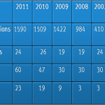
During this year’s annual Innovation Showcase, EMC received 1,590 ideas from global employees. Out of these 1,590 ideas, 357 of them were submitted by a team (as opposed to an individual). My last post discussed the theory that team submissions have a better chance at being selected as a finalist within EMC.
The chart above is our attempt to dive further into this theory.
Each circle in the graph represents an idea submitter that was part of a team (i.e. more than one submitter on an entry). Gray lines between circles represent team relationships – two circles connected by a line indicate that those participants submitted an entry together. The size of each circle represents the associated participant’s number of contest entries. Orange circles represent contest participants with an entry selected as a finalist.
The graph is showing clusters of idea collaborators. The fact that there are a fair number of large clusters suggests the presence of “healthy” innovation networks. The large circles at the “center” of the clusters suggest that there are prolific innovators that are building networks around them. Finally, the orange circles suggest that a fair portion of these influential people are generating good ideas relevant to the business (since they’re finalists).
Action Plan = Stimulate Collaboration
Our team has done a fair bit of financial analysis on award winners from previous years. In many cases the revenue growth (or cost savings) of their implemented ideas has totaled multiple millions of dollars. Often times the ideas that generated these amounts were not award winners. They were simply the result of collaboration around an idea.
Each cluster in the graph above represents a “community” that has a passion for ideas with a certain theme. In the context of EMC, this theme may represent a research topic or customer need in any number of strategic directions: Big Data, automation, flash technology, etc.
Our analytics experts can take any given cluster, identify the names within that cluster, and generate a “cloud tag” that lets us know what general themes that they are talking about. These themes usually map to a set of experts within the corporation that may or may not be involved with the ideators. An introduction can be made between the experts and the ideators, and the concept can be taken to the next level. This can happen organically without the need for heavy processes.
Our growing awareness of “passionate clusters” of global innovators has caused us to roll out a new program within EMC called “Teach the Research”. This program is a follow-on of our existing practice of holding global “Virtual Brownbags” that focuses on the sharing of innovation and research activity around the world.
In future posts I will explain further about our implementation of the “Teach the Research” program, and also drill down further into what our global analytics is teaching us.
Steve Todd
Twitter: @SteveTodd
Director, EMC Innovation Network